
PARAMOUNT+
2023
Redesigning Paramount's Video Player Experience for TV
At Paramount+, I led the redesign of our TV video player as the sole designer, a project that became one of the platform's largest overhauls since its 2021 launch. Partnering with my PM and TV developer leads, I defined the user interaction model now used across all VOD and Live playback on the Paramount+ TV app.

PROJECT DETAILS
Role
Product Designer
Timeline
Oct 2022 - June 2023
Platforms
Roku, Android TV, Smart TV, tvOS
Contribution
Product Design, Interaction Design, Strategy
CONTEXT
A video player inherited from a legacy app
Background
By 2022, Paramount+ had become a major streaming platform, but our TV video player still relied on patterns from CBS All Access. VOD and Live ran on separate codebases with inconsistent designs, forcing every new feature to be built twice. Live TV was also buried: around 40% of subscribers had never watched it, since they had to drill into the Homepage “On Now” carousel or navigate to the Live TV, Sports, or News tabs.
Goal
My role was to create a single interaction model that served VOD, Live TV, and Live Sports across all four OTT platforms, while reshaping how people discovered Live content.
Unify playback across all use cases.
The VOD and Live players had different layouts, behaviors, and codebases. Live Sports reused the Live player but needed some VOD-like behaviors, such as rewinding live content. I was tasked with creating one navigation model that could adapt to all three, without sacrificing consistency.
Add content discovery.
Users spent most of their time in the video player, yet it did nothing beyond basic controls. I saw an opportunity to turn the player into a discovery surface that promotes content related to what the user is watching.
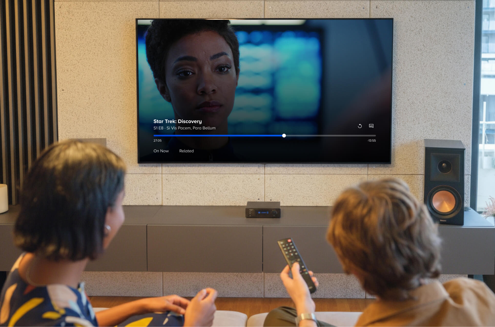
VOD Video Player (Pre-Redesign)
Live TV Video Player (Pre-Redesign)
Live Sports Video Player (Pre-Redesign)
SOLUTION
A unified player platform, built for discovery
Final design
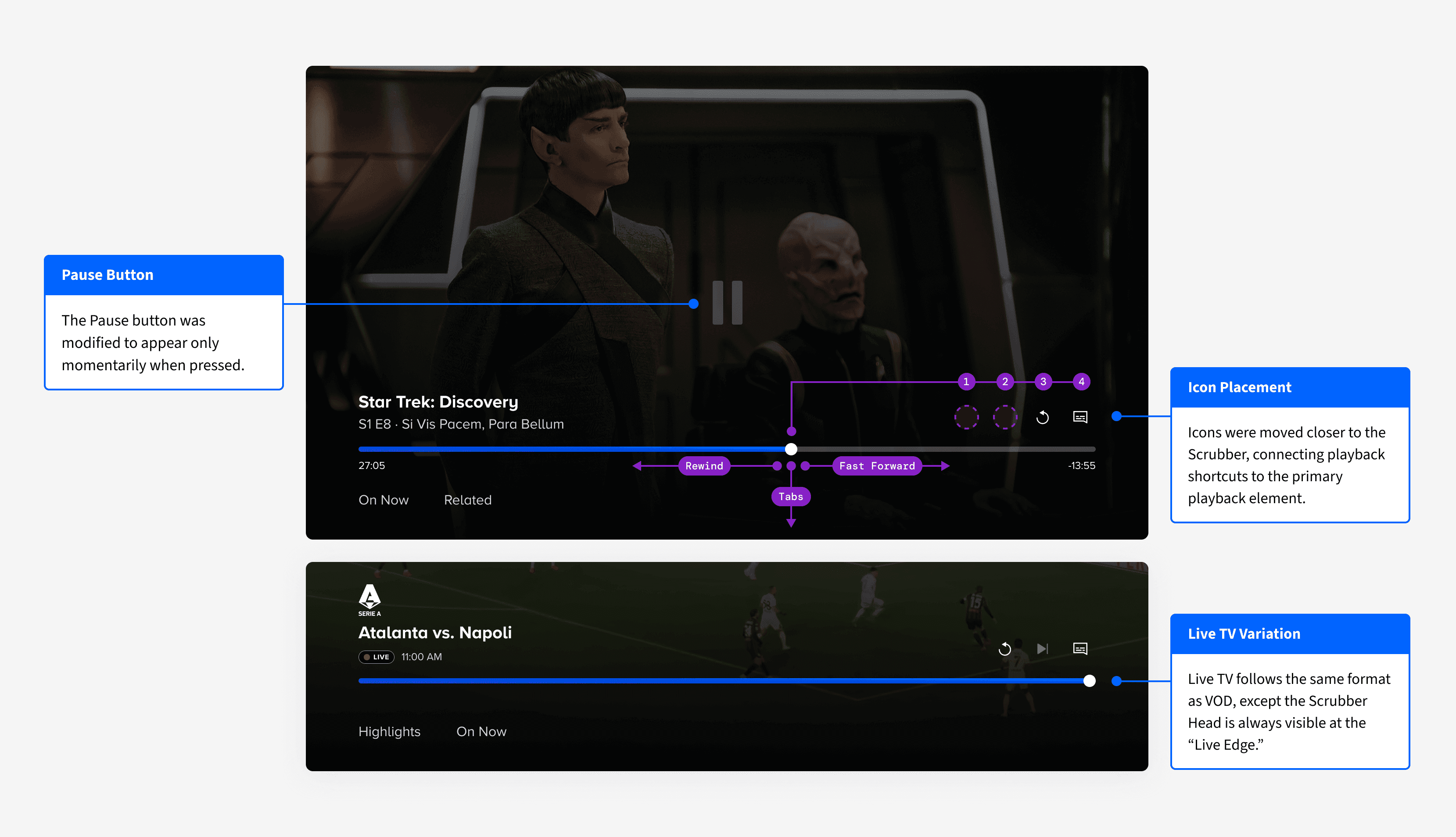
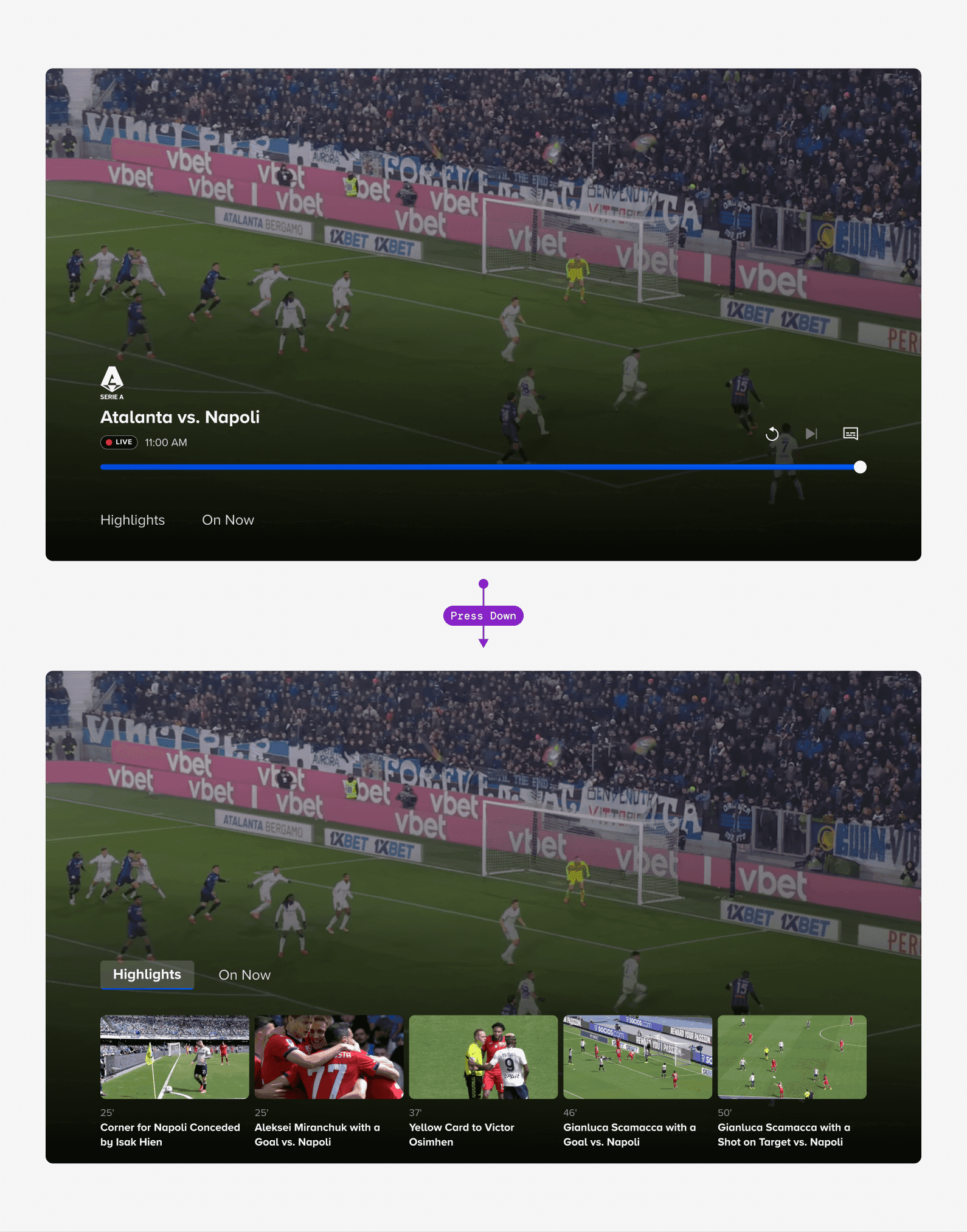
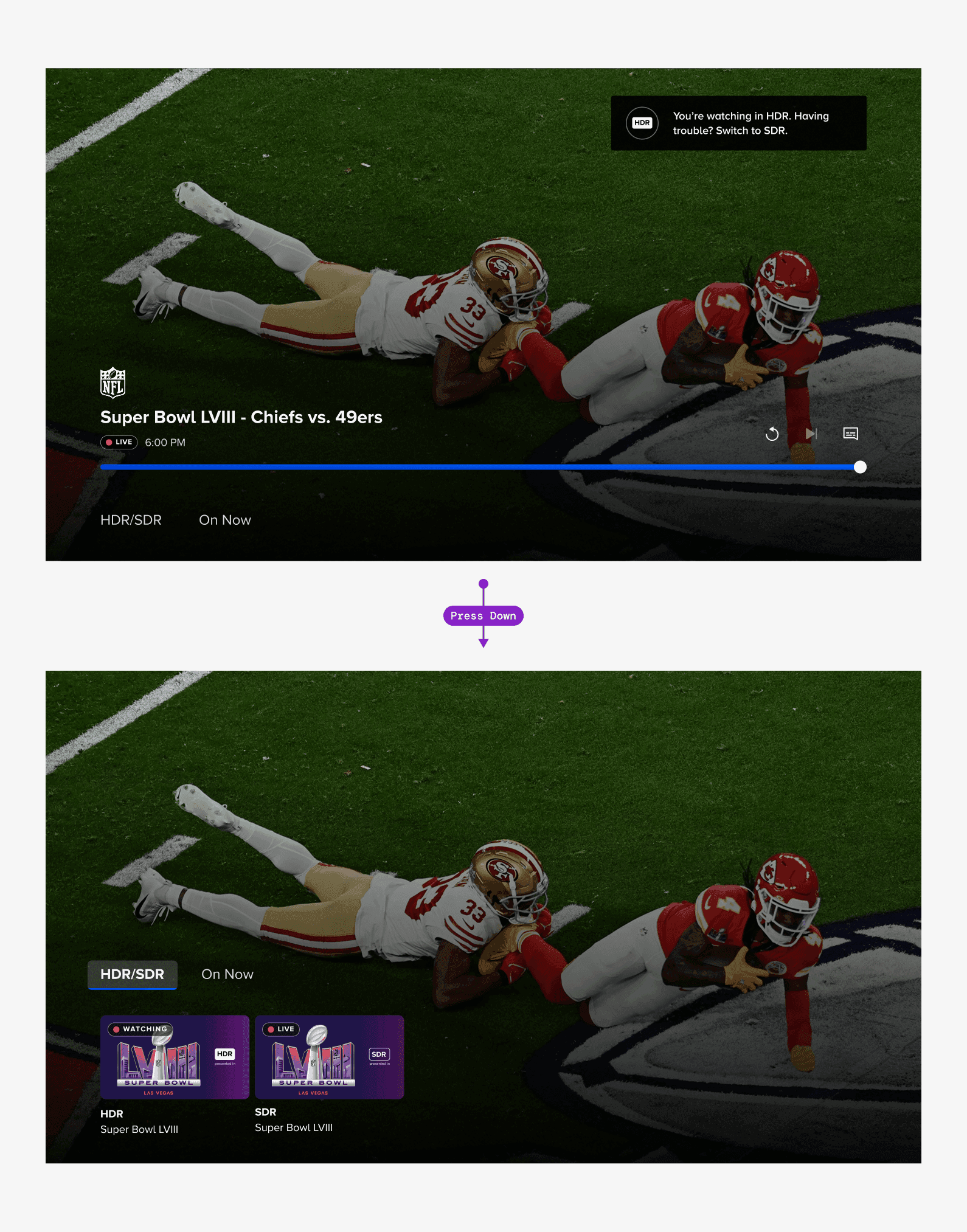
The new TV video player unifies VOD and Live under a single interaction model. All core controls live in a consolidated bottom region: content metadata, scrubber bar, playback controls, and discovery tabs are grouped together in one cohesive area.
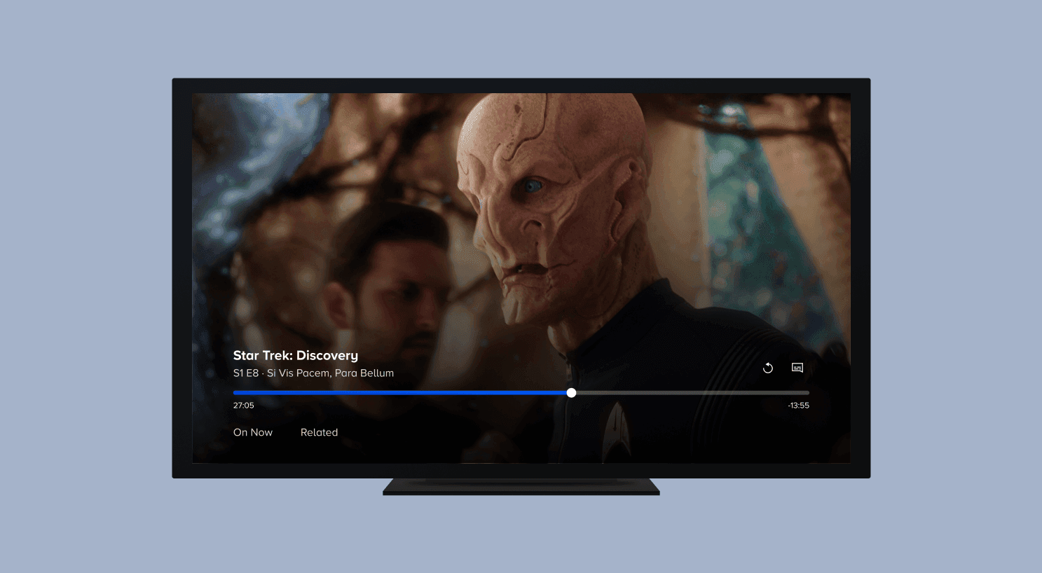
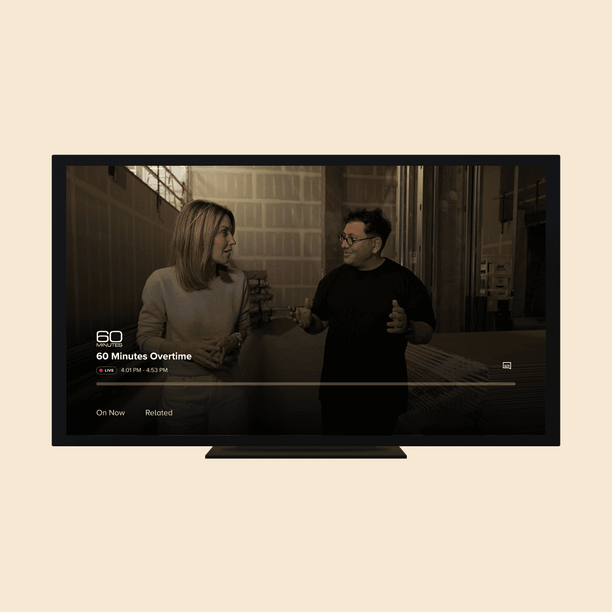

Tabs for in-player content browsing
New tabs sit directly below the scrubber bar, accessible with a single D‑pad press down:
On Now tab.
Surfaces currently live content for any viewer, including those who wouldn’t normally seek out the Live TV section. This became the main way to surface Live TV inside the space where users already spend most of their time.
Related tab.
Shows content similar to what’s playing, supporting discovery when a viewer loses interest or nears the end of a series.
Flexible template approach
The layout adapts for minor differences across VOD, Live TV, and Live Sports (like rewinding live content or a Highlights tab for sports), but maintains the same core interaction model across all four OTT platforms.

PROCESS
Defining the direction
Leading a kickoff workshop
Before designing, I co-led a feature kick-off workshop with my PM and manager. We defined requirements, wrote user stories, and ran a How Might We exercise. Key prompts included:
How might we make core player actions instantly discoverable?
How might we make player focus states crystal clear on a TV device?
How might we provide a similar viewing experience, regardless of content type?
Star-voting surfaced two core themes: navigational clarity and cross-context consistency.
This early alignment set a strong foundation. Subsequent Product x Design reviews focused on refining interactions within those priorities. It ensured we stayed true to the vision from day one.
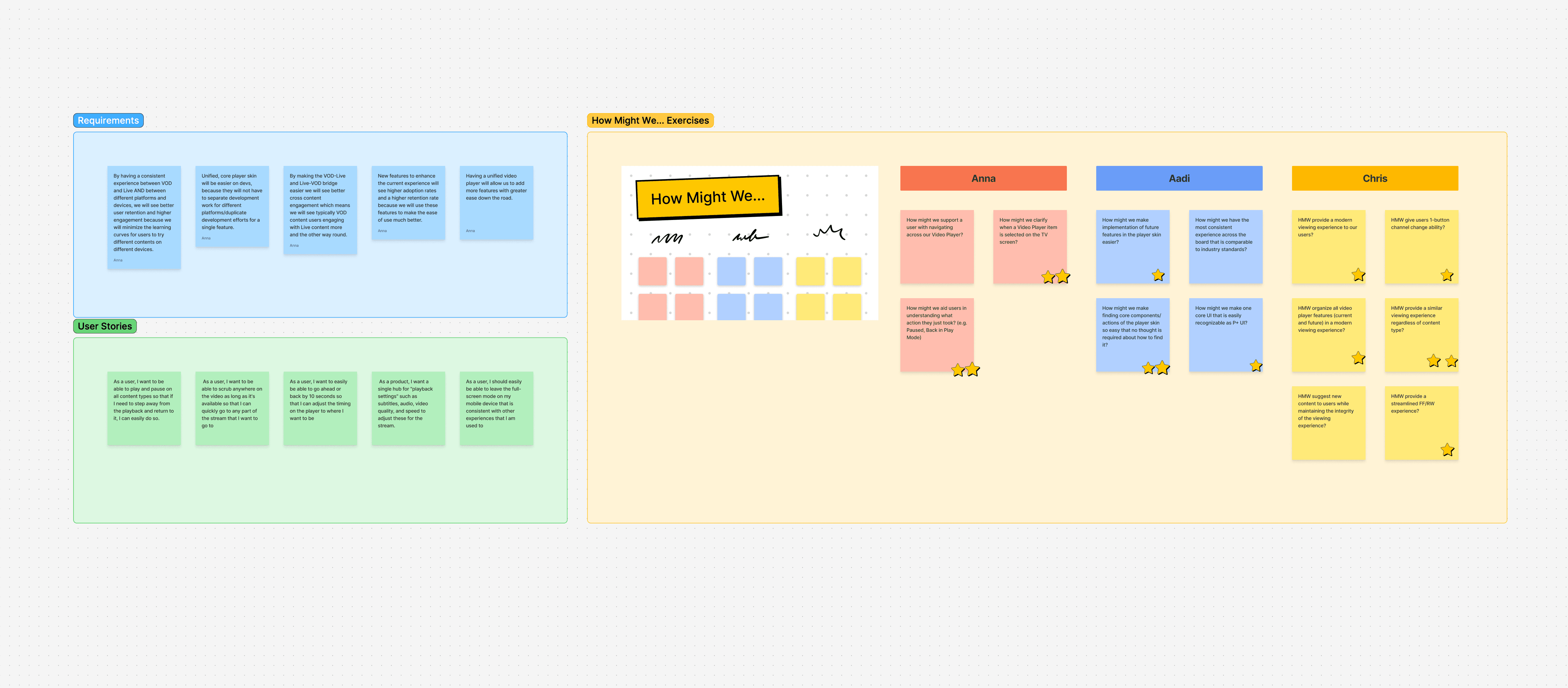

Snippet of our early workshop in FigJam.
The issue with the old player
Leading a kickoff workshop
Controls were scattered around the screen. In the VOD player, metadata was top‑left, the scrubber was at the bottom, and a large pause button lived center‑screen. The Live player used a different layout entirely: channel branding top‑left, a “Live Guide” button bottom‑center, and a LIVE badge bottom‑right.
This made both players hard to parse at a glance and created unintuitive remote paths.
Where We Started

Where We Landed
Layout explorations
Explorations
I explored multiple directions, gradually consolidating controls into a unified bottom region. Early variants kept metadata in the top‑left while tightening the bottom section. Later concepts moved metadata down to sit directly above the scrubber bar, bringing everything into one visual zone.
A key constraint emerged.
Layouts that worked for VOD didn’t always work for Live.
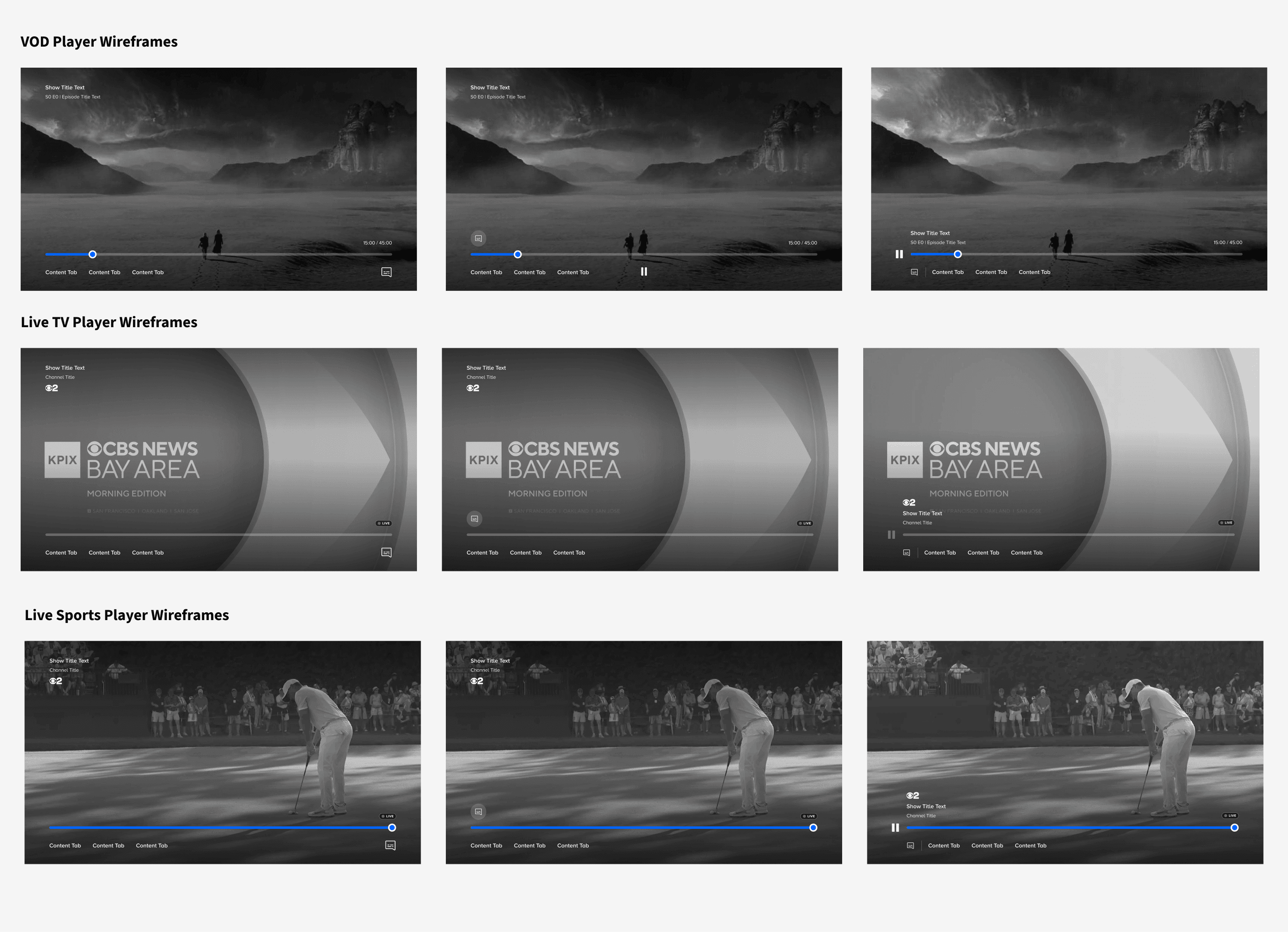
Early explorations testing layouts across VOD, Live TV, and Live Sports.
Final control schematic
For example, a persistent pause button made sense for VOD, but not for vanilla Live TV where DVR controls aren't supported. That pushed me to design a flexible control structure that could adapt to each context, while preserving a consistent template.
The consolidated bottom‑region approach won for three reasons:
It left more content visible.
It created a natural "1-click up or down" D‑pad flow.
It established a canvas below the scrubber that could hold new features, without reworking the layout.
Content discovery explorations
Two options for surfacing content
Once the bottom‑region model was in place, I explored how to surface discovery. I tested:
Text tabs labeled “On Now” and “Related”
A horizontal peek of thumbnails directly below the scrubber
Selected option
We shipped with the text tabs approach because:
Labels clearly communicated what categories were available, before a user navigates down
Thumbnails can get too loud, creating visual distraction.

Comparison of Text Tabs approach, and Thumbnails Peeking approach.
Designing for a 10-ft experience
Review process
TV design is about viewing UI from 10 feet away and navigating it with a TV remote. To pressure‑test sizing, spacing, and accessibility, I regularly used Apple’s Screen Mirroring feature to cast mockups to an actual TV.
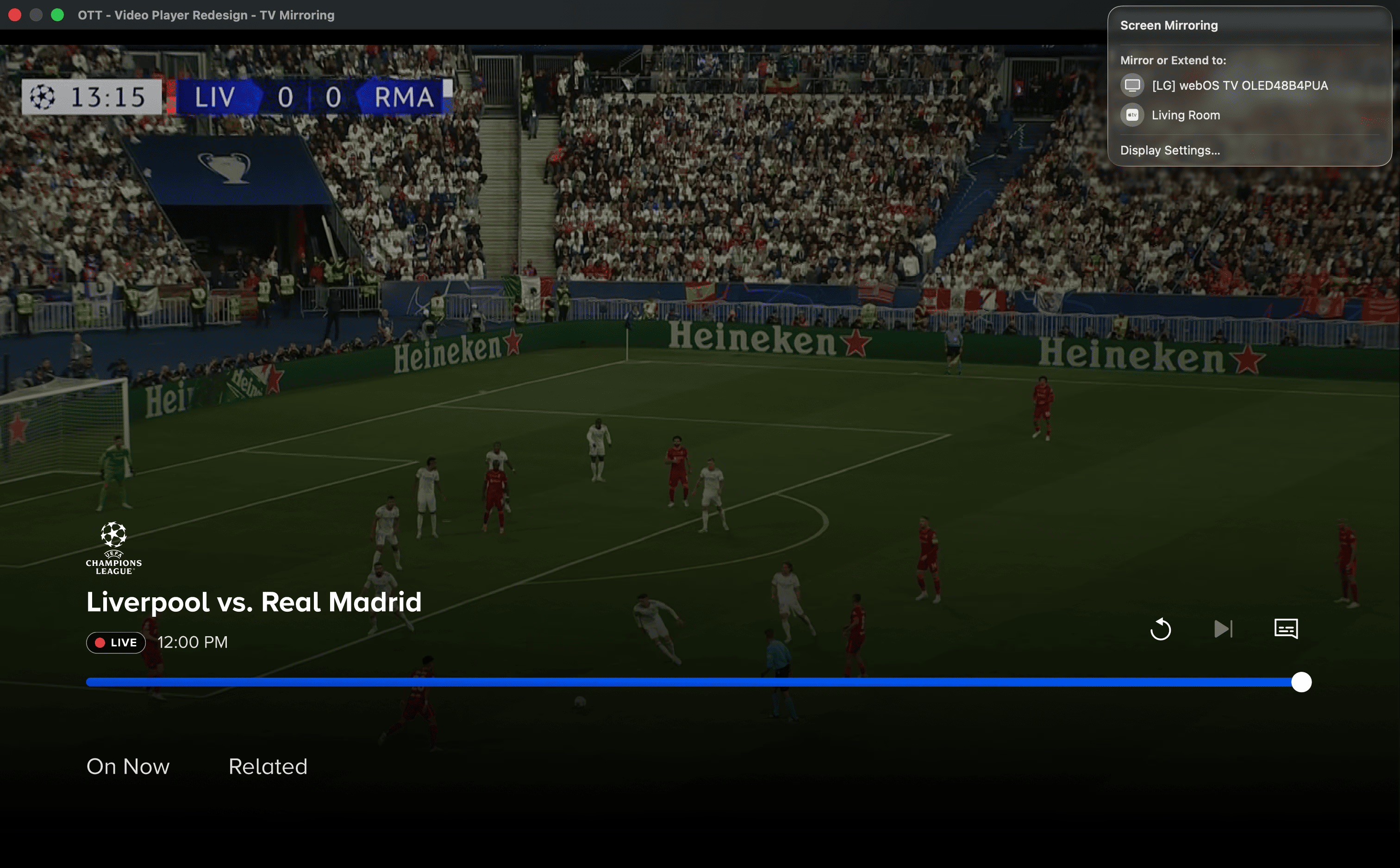
I enabled fullscreen in Figma's prototype view and used the "Screen Mirroring" feature built into Macbooks.
Outcomes
What looked balanced on my laptop almost always needed adjustment at a realistic viewing distance.
I increased the scrubber bar thickness for visibility and focus.
Episode title text scaled up so metadata stayed legible from across the room.
Active focus states were designed to be extra clear from far away.
In the new design, the UI has larger, more legible elements and much more of the screen dedicated to content.

RESEARCH
Post-launch research study
Research method
After launch, the UX Research team ran moderated usability sessions and a quantitative survey with Paramount+ subscribers. I built the prototype flows used in the sessions and observed the moderated tests firsthand.
The new navigation model was intuitive.
Users found consolidated controls easy to use with the remote. Basic actions like pause, play, fast forward, and rewind were immediately accessible.
Discovery tabs added value.
69% of surveyed users found in‑player content valuable, especially the "Related" carousel. They found it useful near the end of a series, or when a show wasn’t holding their interest.
Discovery tabs awareness
Research method
A separate study with Paramount+ Roku users measured awareness of the in-player tabs, about one month after rollout. About half of users noticed the new tabs, but only 15% clicked down to explore them.
Text labels were too subtle for first-time visitors.
Frequent users found tabs organically, but less frequent users needed stronger visual cues. Those who didn't engage were either invested in their current program, or unclear on the tabs' purpose.
Exploration improved sentiment.
Those who explored found the carousels intuitive and helpful for finding new content. These insights prompted us to iterate post-MVP on improving the discovery mechanism.
IMPACT
What this design unlocked
Outcome
The unified player became the foundation for everything that followed. Before the redesign, every new feature had to be designed and built twice. After unification, features could be designed once and shipped across all platforms.
Paving the way for new features
The new architecture enabled features like showing highlight clips from a Live Sports game right in the player, and HDR/SDR video quality toggles for NFL streams. The consolidated bottom‑region layout also gave future designers a clear, scalable canvas: new features could slot into the existing structure without rethinking where controls should live.
Answering leadership's goal
On the content discovery side, the "On Now" tab brought Live TV content into the player for the first time, pulling it out of the buried Homepage and into the space where users already spend the most time.
REFLECTION
What I learned, and what I'd do differently
On design methodology
This project was my first deep dive into OTT‑specific design, and the 10‑ft constraint reshaped how I work. Screen Mirroring became a regular practice during my time at Paramount+, because so many of our designs were TV‑focused. But the bigger lesson for me was: when I'm sitting in front of a laptop for hours, stepping back and literally looking at my work from a distance helped me see it from a new, fresh lens. I carried that habit forward.
On research
The project also changed how I approach decision points. When I’m weighing two close contenders for a design direction, I now reach for a quick research touchpoint early (even an informal one), rather than debating internally or waiting for a formal UX Research phase. It yields answers faster and helps build alignment around evidence, instead of opinions. I took that learning directly into my next project, designing for Promo Reels.